Data Analysis Platform
2025 - RESEARCH / STRATEGY / DESIGN / PROTOTYPINGWhile working for Cambridge University Press & Assessment, I was responsible for leading the design of a new data analysis product for educators. I led UX design and research, aligned various stakeholders and managed high requirements.
Introduction
The project's purpose was to replace two outdated data analysis platforms that allow educational institutions to analyse their students' performance and provide insights to adapt and improve their approach to teaching. The UK-market product delivered a more in-depth analysis into specific data points, while the international product delivered a shallower scope with more emphasis on ease of use. The ambition is to combine these two products into one service that can deliver products for different markets on the same infrastructure.
Starting out
When starting on the project, I reviewed previous research analysis and the current design, which already gave me a good idea of what to expect: challenges with navigation and confusion over a lack of consistency across data views. There was a round of research already scheduled and I adapted the test plan to cover some questions that came up during my review.
UK user interviews
Through the interviews, I refined and expanded on previous discoveries with deeper understanding of user needs. In prototype tests concluding the interviews, I understood how users see the information they navigate and analyse. As anticipated, participants were confused by conflated layers of data in the navigation hierarchy. While interviewing them about their experience, their mental models emerged naturally.
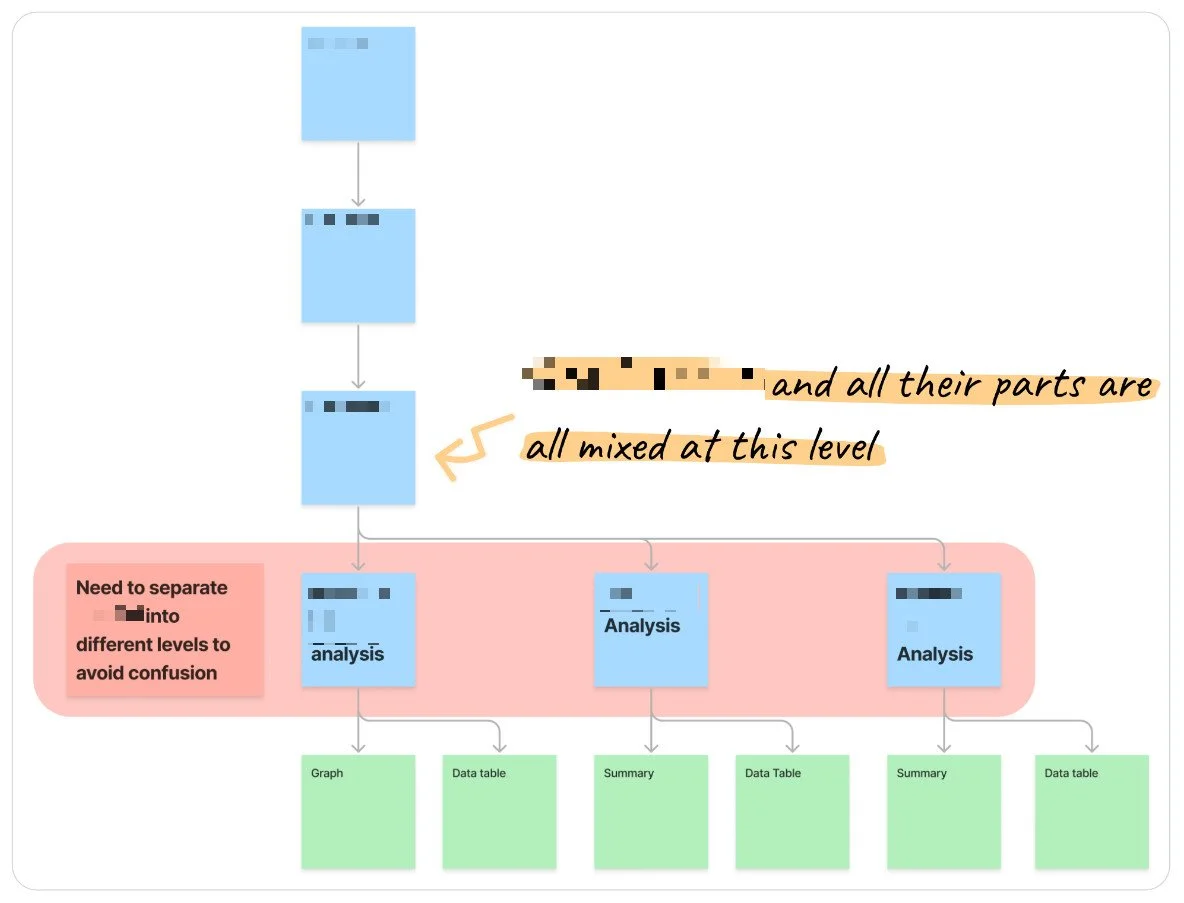
Addressing navigation and information architecture
With the product and business analysis team, I ran an information mapping workshop to build understanding of the information space within the team. This also helped me double-check my own analysis of a common mental model that I based on the interviews.
I started designing a natural flow through the information hierarchy that provide insights on separate but consistent views for each level. A tree test with this information architecture showed a strong improvement over the original architecture across success, directness and confidence metrics.

To convey this approach effectively, I wireframed what the product might look like. There were concerns about a considerable amount of re-development that would have to be done to the technical PoC, which would reduce the amount of functionality we could deliver for our pilot test. Despite these concerns, I convinced both developers and stakeholders that this modular approach is not only better for users to navigate, but it will also allow us to adapt, scale and maintain the product much more easily in the future. The wireframes proved a valuable discussion aid here, making it easy to point out repeating elements and opportunities to expand.
International user interviews
With consensus built across the team, I prepared for a second round of research using a prototype based on the new information architecture. At the same time, I supported project leadership in conveying our decision and how it improved the long-term prospects of the project to our directors.
This round focused on the same discovery questions as the first round to identify any differences between UK and international users. It turned out, that most needs overlapped between markets. I also identified opportunities related to but outside the scope of our project in the international market, which I relayed to the wider team and leadership.
This group, less burdened with the navigation, got to focus a lot more on the actual interpretation of data. Through that focus, I got to explore a lot of the challenges that data analysis poses to less data-literate users. They struggled with derivative data proportionally to the level of abstraction, meaning the more variables fed into a table or visualisation, the more difficult it became to interpret intuitively. The difficulties they were facing were not just about abstract data, though, but also about the technical language used. These interviews helped provide a clearer direction and next steps.
Pilot preparation
With a now well-defined set of user needs and platform requirements, it was straightforward to prioritise different functionality and features, as to build a dynamic roadmap towards our pilot test. In order to improve communication, particularly with the developers, I annotated screenshots of the "ideal" state. I marked different parts according to the MoSCoW prioritisation I conducted in coordination with product leadership. This helped everyone set realistic goals and expectations for the pilot, and flag any risks towards achieving the pilot scope, as well as for possible future challenges beyond the pilot towards MVP.
Key challenges and solutions
Common vision
When I joined, there was a lack of common vision across the team. Each speciality seemed to be somewhat disconnected and sometimes stakeholders would talk past each other about the same points meeting after meeting.
To resolve this issue, I had many 1-on-1 conversations and workshops with stakeholders and subject matter experts to understand the different points of view and communication styles. I found that most stakeholders on the project responded well to visual aids for discussion, because they reduced the reliance on technical and in some cases ambiguous, department-specific terms.
Some stakeholders held very strong opinions on particular requirements. Those discussions I shifted from a feature-focus to an outcome-focus, trying to understand why exactly they thought a particular feature was important. These outcome-oriented discussions often reduced conflict and created a more common understanding of our direction as a team.
Complex information environment
Working in a B2B2C space is inherently complex. Add to this different markets, very different types of educational institutions, and a whole range of slightly to very different data-structures to navigate and analyse, and I found myself in Muddle Earth.
Luckily, I thrive in complicated environments and thoroughly analysed and visualised all necessary information at different levels to support communication in and outside the team. By having a map of all the information and how it related to each other, I was able to take different "slices" of it. This enabled me to abstract and contextualise user needs and business requirements to make navigation and hierarchy just that much more intuitive. Success with this didn't just show in our user research with an immediate elimination of navigation struggles from one iteration to the next, but I also got repeated feedback from colleagues across specialties that my visualisations helped them understand problems better and work more effectively.
Making data accessible
The difficulty with this capability as opposed to regular consumer products is, that while the user-base currently has low data literacy, in order for these products to be useful, they need a certain amount of complexity in the data and its analysis. This means trying to toe a line between simplifying insight, offering stepping-stones and learning aids, and providing the necessary training for teachers that - depending on the subjects they studied - may not have been part of their core education.
To address this challenge, I discussed it extensively with stakeholders, and there are a number of threads still being pulled to figure out the best possible approach across the organisation. This includes professional development courses and webinars for teaching staff, as well as different formats of in- and off-platform tutorials, as well as research questions to inform these.
Infrastructure dependencies
The whole project depends on capabilities developed and maintained outside of the core team. This meant repeated delays in development as we were at the behest of other teams' resources and priorities. Faced with these delays, we had to make unfortunate compromises and some of our ambitions had to be scaled back to create a more streamlined and functional capability - at least in the immediate future. The best I could do here was to document impacted design decisions and make sure that those collaborating directly with the infrastructure team know about the long-term design goals relating to data-flow and -delivery.
Lessons learned
Throughout my involvement with this project I got a lot of opportunity to practise my soft-skills and product leadership. I managed to gain a lot of influence on the project's direction - not by power vested in my position but by listening, understanding and incorporating and interrogating feedback with rational insight.
I also refined my understanding of when to pursue and when to back down from challenging established processes to realise product opportunities.
Given how inter-connected large organisations are, in many instances designers need to try and affect organisational change to create an environment where good solutions can work and improve efficiency, effectiveness and capability of the whole organisation. I want to learn more about change management and how to best collaborate with change management and business analysis teams earlier in the design process.